 Jiho Jang, a master candidate of CED lab. has presented his recent study entitled, “Disappearing Icons: Informative Effect Through Changing Color Attributes of App Icons” on the IEEE International Conference on Consumer Electronics (ICCE 2014) in Las Vegas. This study investigates the informative effect that color attributes of smartphone application icons have on users’ perceptions when presented in unusual ways.
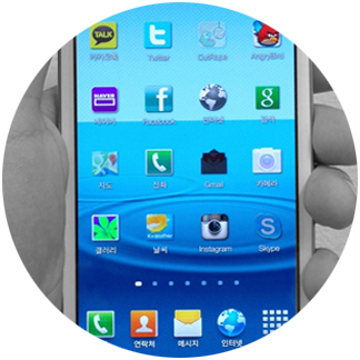
Abstract: This study investigates the informative effect that color attributes (hue, saturation, lightness, and opacity) of smartphone application icons have on users’ perceptions when presented in unusual ways. Two empirical studies were conducted: First, we focused on which changes draw eye attention more efficiently than others; second, we attempted to observe whether participants perceive any status change of the application by viewing the change. Three overruling tendencies were observed: First, changed hue and lightness of icons were most noticeable. However, both changes sent unclear message to users; Second, decrease in saturation or opacity of icons were perceived as the apps being used less; Last, excluding hue, all attributes need to have dramatic changes in order to let users be aware of the both change and informative effect. Based on empirical results, we propose Disappearing Icons in which smartphone icons become transparent/greyscale over time to inform users of app usage patterns.
Full text in conference procceeding